When it comes to sales funnels, design is everything. Choosing the right colors, typeface, and format can make the difference between a successful funnel and one that fizzles out. But making a good design isn’t always easy.
There are five crucial sales funnel design elements: Color schemes, typeface, imagery, whitespace, and CTA buttons. The layout of your sales funnel also matters, as does the order in which your content appears. When designing your sales funnel, it’s important to add all of these elements.
This article will cover everything you need to know about sales funnel design, from choosing the right colors to avoiding common mistakes.
Color Schemes: The Right Colors Can Make or Break Your Funnel
When it comes to color schemes, there are two schools of thought.
Some people believe that using too many colors can be overwhelming, sloppy, and will turn people away.
Others believe that a well-chosen color scheme can add appeal and make your funnel more visually appealing.
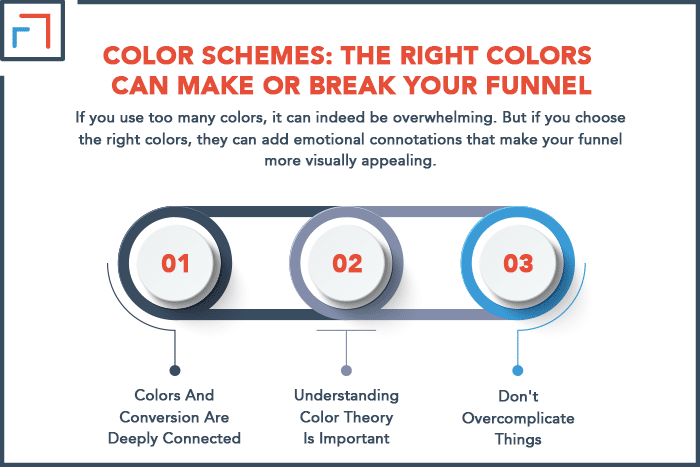
There is some truth to both of these ideas. If you use too many colors, it can indeed be overwhelming.
But if you choose the right colors, they can add emotional connotations that make your funnel more visually appealing.
Ideally, you should find a happy medium between these two extremes. A good rule of thumb is to use no more than three to five colors in your design scheme.
Here are a few tips for choosing the right colors for your sales funnel.
1. Colors And Conversion Are Deeply Connected
Use colors that are known to convert.
For example, reds and black tend to convert better than other hues because they’re associated with urgency, excitement, or trust in the product being sold.
Orange has also had good results in this category due to its natural association with heat and vibrancy.
The right hue can make people feel comfortable and excited about the products in your sales funnel.
Green can bring a pleasant natural connotation to your brand.
If one of your selling points is your eco-friendliness, you’ll want to include at least one shade of green in your color scheme.
It’s also a cool color that helps people feel more relaxed when interacting with your funnel.
2. Understanding Color Theory Is Important
Most people are familiar with the basics of color theory.
But when it comes to sales funnel design, it’s essential to consider both the light and dark versions of each color.
You’ll want to ensure that the colors you choose work well together in both light and dark contrast.
For example, red and green are complementary colors. But if you use light green, it can look washed out next to a dark red.
Similarly, if you use a very dark green, it can look almost black next to a very light red.
To avoid these issues, you should play around with the different hues and values in your design.
You can also use a tool like Adobe Color or Color Hunt to create a custom color scheme that includes both light and dark versions of each color.
3. Don’t Overcomplicate Things
If you’re unsure which colors to choose, start with a basic color scheme like black and white. From there, you can experiment by adding one or two accent colors.
For example, if you’re selling products for men, you might try a scheme of black, white, and blue.
Or, if you’re selling products for women, you might try a scheme of black, white, and pink.
Once you’ve found colors that you like, stick with them. Don’t complicate things by adding too many colors.
The goal is to find a scheme that is visually appealing and easy to understand.
You should also keep your color scheme consistent across your various funnel pages because this helps your brand feel unified.
Typeface: Fonts Can Make a Huge Difference
Your choice of typeface can have a significant impact on your sales funnel.
The right font can make your funnel easier to read and understand. Conversely, the wrong font can make it difficult to read and less appealing.
There are two types of fonts that you’ll want to include in your sales funnel:
- Serif: These are the ones with the little feet on the letters (like Times New Roman). They’re generally thought to be more readable because the feet help lead the eye from one letter to the next.
- Sans-serif: These fonts don’t have the little feet (like Arial). This makes them perfect for headlines where you want to make an easily legible statement.
When it comes to sales funnel design, you’ll want to use a sans-serif font for headlines and a serif font for body copy.
By choosing these different font types, you’ll maximize reading efficiency. The contrast also provides some visual interest.
You’ll also see some funnels using slab serif fonts (like Rockwell) or script fonts (like Zapf Chancery).
These can be used sparingly to add some interesting quirks to your funnel. Just be careful not to overdo it. Too much of a good thing can quickly become a bad thing.
Imagery: Less Is More
When it comes to using images in your sales funnel, less is more. You’ll want to use high-quality pictures that add value to your funnel.
But at the same time, make sure you don’t use so many images that your funnel becomes cluttered and difficult to navigate.
The best way to find high-quality images for your sales funnel is to use a stock photo service like Shutterstock or iStockphoto.
These services have millions of high-quality images that you can use for your funnel.
If you’re on a low budget, you can also find free images on sites like Unsplash or Pixabay. Just be sure to read the terms of use before using any of these images in your funnel.
When selecting images, look for ones that are relevant to your product or service.
For example, if you’re selling a product for gardeners, you might use an image of a garden.
Or, if you’re selling a service for businesses, you might use a picture of a cityscape. Generally, it’s best to avoid using images of people in your sales funnel.
People are hard to relate to and are often viewed as cheesy or salesy. If you do use images of people, make sure they’re high-quality and professional looking.
The last thing you want is for your funnel to look like an infomercial!
Whitespace: Don’t Be Afraid to Use It
Whitespace is the blank space on a page. When it comes to the visual aspect of sales funnel design, whitespace is your friend.
Through the power of positive contrast, it can help you create an appealing and memorable design.
Whitespace can help break up your funnel and make it more readable. It can also highlight certain elements of your funnel that you want people to notice.
Above all, it helps you to deliver your message in a way that is easy for people to understand.
However, strategic placement of whitespace is critical. You don’t want to use too much whitespace, or your funnel will look unfinished and blank.
But on the other hand, if you don’t use enough whitespace, everything will look cluttered and cramped.
If things are too close together, it’s harder for our brains to pick out the important parts.
The best way to find the right balance of whitespace is to experiment. Try different combinations of text and images to see what looks best.
And don’t be afraid to ask for feedback from your peers. They can often help you spot things that you might not have noticed on your own.
CTA Buttons: Make Them Stand Out
Your call-to-action (CTA) buttons are some of the most essential elements of your sales funnel.
They’re the thing that tells people what you want them to do next. Because they’re so important, they need to be designed in a way that is clear and easy to see.
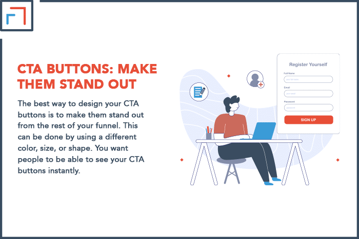
The best way to design your CTA buttons is to make them stand out from the rest of your funnel.
This can be done by using a different color, size, or shape. You want people to be able to see your CTA buttons instantly.
Another important thing to keep in mind is that your CTA buttons should be placed in strategic locations.
They should be positioned in places where people are most likely to see them and take action.
For example, you might want to put a CTA button at the end of your sales pitch so people can buy your product or service.
Finally, ensure your CTA buttons are relevant to the offer you’re promoting.
For example, if you’re promoting a free ebook, your CTA button should say something like, “Download Now.”
If you’re offering an online course, your CTA button might say, “Enroll Now.” Be specific with your wording.
By following these tips, you can ensure that your CTA buttons are designed for maximum effectiveness.
Layout: Keep It Simple and Easy to Follow
The layout of your sales funnel is also important. You want to keep your funnel simple and easy to follow.
This means you should use a clean and uncluttered design. In addition, your design should use a logical flow of content that is easy for people to follow.
Using a single-column design is an excellent way to simplify your funnel layout.
This kind of design allows you to present all the information in one place without requiring readers to jump from column to column.
This format ensures that your funnel is easy to scan and doesn’t contain any unnecessary elements. Also, keep the placement of your content in mind.
You want to make sure that your most important content is placed “above the fold,” which means it doesn’t require you to scroll down to see it.
A linear flow is another way to keep your funnel layout simple. Each step in your funnel leads directly to the next step.
There should be no dead ends or side paths in your funnel. Instead, everything should be moving forward in a straight line.
Of course, you must also ensure that your funnel design is visually appealing. A good format should include attractive designs as well as useful content.
Use colors and images to break up the text and add interest. And don’t forget about your headlines!
Common Sales Funnel Design Mistakes and How To Avoid Them
Now that you know the basics of sales funnel design let’s take a look at some common mistakes people make. If you know about them, they’re easier to avoid.
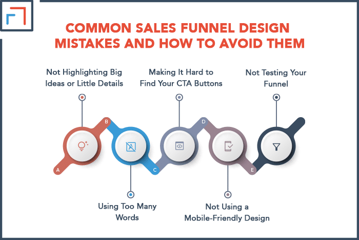
1. Not Highlighting Big Ideas or Little Details
When you’re writing your copy, it’s important to highlight both the big ideas and the small details.
The big ideas are the overall concepts that you want people to remember. The little details are the specific points that support those ideas.
For example, look at this post. Since we’re writing about sales funnel design, the big ideas include the importance of simplicity and visual appeal.
The little details explore the specific design tips, such as using certain font types and color schemes.
By including both the big ideas and the little details in your copy, you can ensure that people will remember the concepts you’re presenting.
This will help them connect with your funnel and take the desired action.
2. Using Too Many Words
One of the most common mistakes people make is using too much text.
Remember, people have short attention spans and are often scanning content rather than reading it word for word.
As such, you want to make sure that your content is easy to browse and doesn’t contain any unnecessary words.
A good rule of thumb is to keep your paragraphs short and to the point. No one wants to read a huge block of text.
And don’t forget to use headlines, subheadings, and bullet points to break up your text and make it easier to read.
3. Making It Hard to Find Your CTA Buttons
As we mentioned earlier, your CTA buttons are one of the most important elements of your funnel.
But if people can’t find your CTA buttons, they will not be able to take the desired action.
Make sure your CTA buttons are big, bold, and easy to find. They should be placed strategically where people are most likely to see them.
In addition, they should stand out from the rest of your content so people can’t miss them.
4. Not Using a Mobile-Friendly Design
More and more people are using their smartphones and tablets to access the internet.
As such, you must ensure that your sales funnel is designed for mobile devices as well as desktops.
You should use a responsive design that looks good on all screen sizes. Don’t forget that your CTA buttons should also be easy to click on a small screen.
In many cases, you should avoid using any Flash or Java-based elements because these are not supported on most mobile devices.
5. Not Testing Your Funnel
Once you’ve designed your funnel, it’s crucial to test it to make sure everything is working as it should.
Test all your links and CTA buttons to ensure they are working correctly.
For good measure, you should also test your funnel on different browsers and devices to make sure it looks good and functions properly across the various platforms.
By taking the time to test your funnel, you can avoid any potential problems and get your funnel ready for its launch.
Final Thoughts
Now that you understand the basics of designing a sales funnel, it’s time to start implementing these principles.
Remember that design is an ever-evolving process, so you shouldn’t be afraid to experiment with different colors, fonts, and layouts until you find what works best for your business.
Avoid making common mistakes like using too many words or making it hard to find your CTA buttons.
Always test your funnel before launching it to ensure it’s working properly.
With a little effort and creativity, you can create a sales funnel that looks great and helps increase conversions.