A good funnel design must be aesthetically pleasing and communicate the intended message. However, developing a great design is difficult. Fortunately, funnel design ideas can inspire you to create amazing designs that convert.
Some of the best funnel design ideas include the use of background videos, bold colors, large typography, brightly colored call-to-action buttons, split screen layouts, and fewer landing page navigation links. Brands that use these ideas have developed attractive and effective funnel designs.
This post will discuss various funnel design ideas and how you can implement them in your next design. Sometimes a little tweak can make a significant impact on your success!
6 Practical Funnel Design Ideas To Inspire Your Next Design
Designing a successful funnel takes creativity, time, patience, and lots of testing and optimization. Funnel design ideas can help you create stunning designs faster.
To get started, follow along with the tips below and check out the real-life examples of successful brands.
1. The Use Of Background Videos
One of the best ways to use visuals on your funnel landing pages is to incorporate some background videos into your design. This is also a trend that has been sweeping the world of funnel design.
Using animations in place of static backgrounds livens up your page and increases engagement. When visitors are engaged, they spend more time on the page as they interact with the video.
Increased engagement helps drive conversions because videos can be quite informative and compelling.
Videos also help enhance the message of your copy, thus increasing the chances of your audience taking action. Look at this example from The Hidden Worlds of Nature Parks.
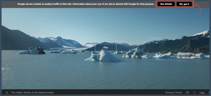
Clicking on the play button takes the visitor on a tour of National Parks. After seeing various scenic views, the visitor is presented with a call to action inviting them to “Start Exploring.”
Another astonishing example of the use of the video background is by FoodBloggerPro. They reported a 138% increase in conversion rate because they switched from a static background to a dynamic one.
Video backgrounds are a great way to spice up your landing page design. When done right, these visual elements can boost your conversion rate.
How To Switch To Video Backgrounds The Right Way
Although video backgrounds are great, you should avoid some common mistakes when implementing them. Here are a few pointers to help you switch your backgrounds successfully.
- Do not just use videos because they are trending. Your videos should be accompanied by specific objectives. They should also reflect your brand values, voice, and message.
- Ensure your videos are in harmony with the rest of your landing page copy and calls to action.
- Avoid auto-playing audio.
- Keep video size in mind when creating videos because huge file sizes reduce page speeds, and you certainly don’t want that. Consider looping your videos and keeping them small (like 6MB).
2. Elimination Of Navigation Menus
Landing page navigation is another crucial design element that directly influences your funnel’s conversions.
Although navigation bars offer additional information to readers, they contain clickable links that lead readers away from the landing page.
Unfortunately, this defeats the purpose of a landing page. These menus act as a distraction that prevents readers from clicking on the call to action.
Therefore, in order to emphasize the call to action, a great landing page should not contain navigation bars.
The above landing page has no navigation links. This helps redirect all the attention to the call to action button. The page also lacks exit navigation links.
As such, readers stay on the landing page long enough to take action. In turn, this leads to a higher conversion rate. Another example comes from Salesforce.
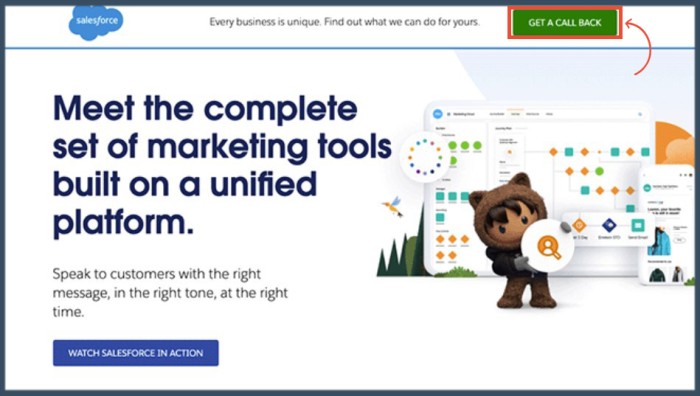
Aside from the lack of navigation links on the Salesforce landing page, it has persuasive and attention-grabbing headlines.
Together with visuals on the right, the landing page design works to point readers to the calls to action.
How To Design A Landing Page Without Navigation Links
Thanks to the availability of great sales funnel builders, creating landing pages without navigation menus is an easy task. All you need to do is choose a tool that suits your needs and budget.
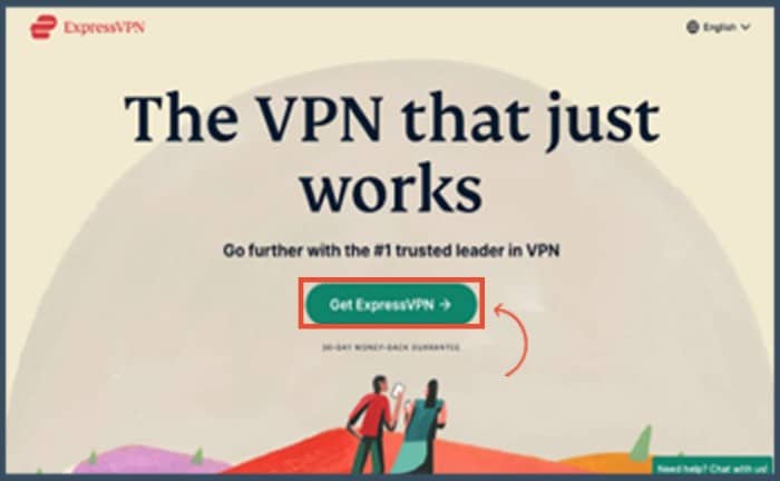
Some of the best landing page builders include Clickfunnels, Instapage, and Unbounce.
3. The Use Of Bold Colors
The use of colors not only helps to identify with your brand but it helps set the mood, grab attention, and change visitors’ impressions about your brand.
There is a lot of competition among brands in the online space; hence brands need to work hard to stand out. Using bright colors allows your brand to survive in the sea of competitors.
As such, the use of bright and bold colors has become an unstoppable trend as more brands adopt this design idea. Let us look at some brands that use bold colors.
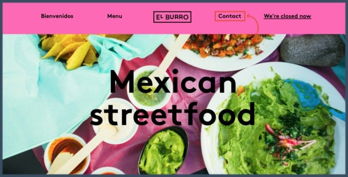
The above Mexican has managed to blend odd colors like yellow, lime, and hot pink to create an inviting palette. The result is a fun, exciting, and energetic experience.
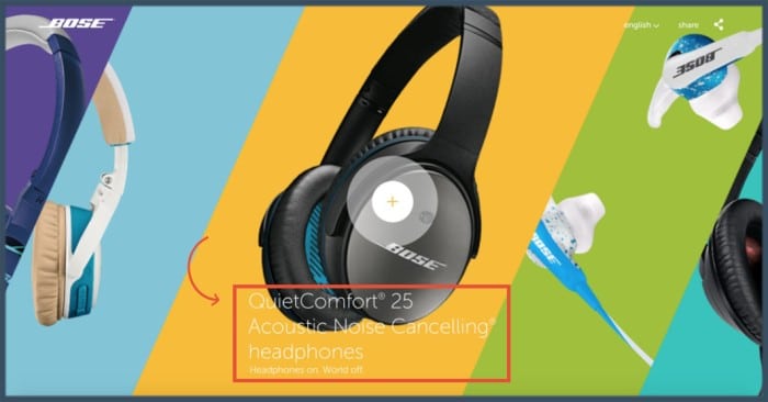
Another great example of a page that uses bold colors is Bose. It creatively blends unusual colors to create a unique palette that is attractive and engaging.
It uses different colors to create splits that represent different products.
How To Use Bold Colors In Your Design
The colors you choose can either make your design stand out or make it hard to look at. As such, you need to carefully consider your color choices and combinations.
Ensure your colors represent your branding and values. Below are a few more tips to inspire you.
- Colors always carry a meaning. If you combine the right colors, you can convey a message without even using words
- Colors like blue, hot pink, and purple can help you create futuristic color schemes
4. The Use Of Split Screen Design Layout
The split screen design layout enables you to divide your screen into two or more parts. The result is the ability to display two or more messages simultaneously on the same screen.
Another perk is the ability to combine text with other elements of visual storytelling, like images and videos.
You can also add dynamic elements to one part of the screen while keeping the other one static. Organizing content into sections makes your landing page more appealing and engaging.
Therefore, it makes your content easy to view and consume.
The split screen layout is perfect when you want to display two or more products so users can easily compare and contrast the different options.
It is also ideal for those looking for a minimalistic design that prevents clutter. Below are a few examples of brands that are reaping big rewards from the use of the split-screen layout.
Our first example is from the Split Fold Landing Page.
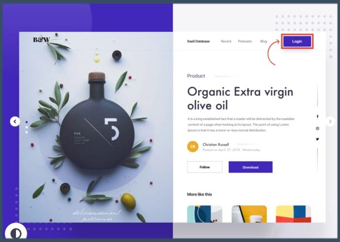
The brand uses the split-screen layout to offer product descriptions. In this particular example, the brand displays a high-quality product image on one side.
On the adjacent side, the brand has a concise product description, a clear call to action, and a ‘more like this’ section. This design enables Split Fold to present all the information about the product at a glance.
It also enhances the user experience because users do not need to keep scrolling or navigate to another age to get all the details. Another perfect example is the Restore Hope Appeal by Compassion.
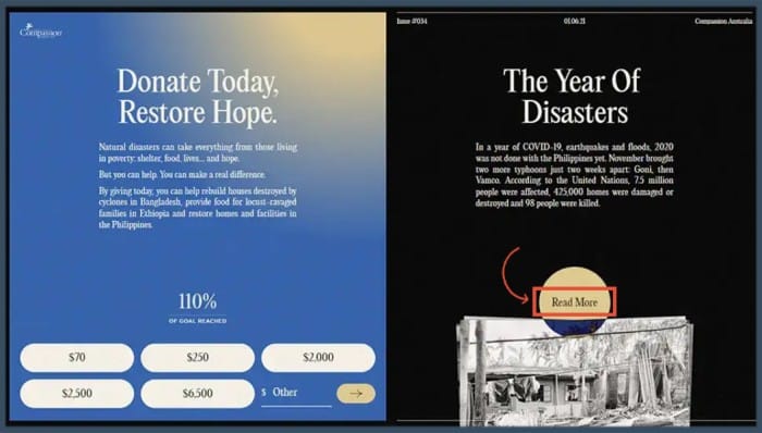
The Restore Hope Appeal website aims to collect money to fund areas that have been stricken by disasters all around the globe. The split screen communicates two distinct but related messages.
On the first screen, the organization uses a blue color as a symbol of hope. The color is in harmony with the message. On the adjacent screen, the color takes a sharp turn.
It is now black, symbolizing bad news such as the year of disasters, including COVID-19, floods, and earthquakes. The dark color and the image at the bottom support the message of the copy.
Users looking to donate to this page can immediately understand the situation at hand and what they need to do.
You can also use split-screen for signups, especially if you have a different sign-up or log-in categories, the same way Hiristic has done it below.
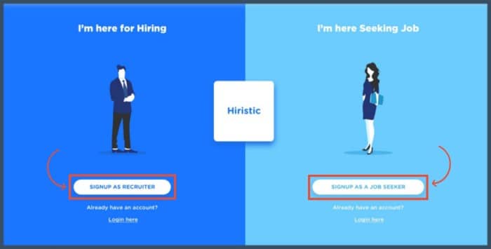
Hiristic allows recruiters and job seekers to access their respective sites simultaneously through the split screen.
How To Use Split Screens
- Combine bold colors with dramatic typographies to create a stimulating and appealing visual design that attracts the attention of readers.
- Take advantage of the split screen to draw attention to the main call to action. When used appropriately, the vertical divide alongside the use of negative space makes your call to action pop.
- Keep your screens simple and avoid using them for detailed content because it can be counterproductive.
- Utilize animations and interactive effects to persuade readers to take action.
5. The Use Of Big Typography
The use of large typography has been trending (and for good reason). Big typography enhances text legibility so more people can see your message.
Other than that, it communicates the message and the tone of a brand and helps it stand out from the crowd.
When large typography is used, it consumes a large portion of the page and leaves less room for additional elements.
As such, it promotes minimalism and helps designers avoid a busy design that causes eye strain. The result is a neat and legible page that drives interaction.
In addition to being easy to read, large typography enhances visual hierarchy. The large size stands out from the rest of the text, thus attracting attention.
Therefore, the reader’s attention should be directed to the most important sections of the page. Kashoo is one of the best examples of brands that utilize large typography.
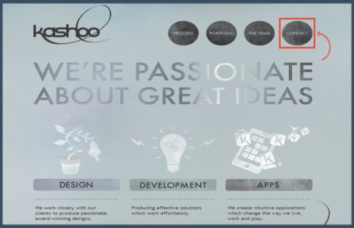
The large words “ we are passionate about great ideas” attract the attention of the reader and inspire curiosity in them. The reader can’t help but want to find out what great ideas Kashoo is passionate about.
Kashoo is a team of creative designers, developers, and experienced marketing consultants.
Their brand authority and the use of interesting typography lure readers into staying and reading on for further details.
Another great example is from Red square, a remarkable agency in media and design. Take a look at how they employ design typography below.
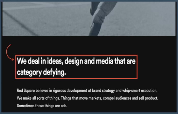
The design of the above homepage features an accurate combination of effective typography and appropriate color palettes.
The result is a clean and enticing design that is easy on the eyes and gets straight to the point.
As the home of category-defying ideas and designs, it’s fair to say that Red Square operates true to its mission. As such, its design reflects the same values it is looking for.
The text on the page is also attractive, thanks to the meticulous choice of font styles.
How To Use Large Typography In Your Funnel Design
The use of large typography is more than just using big typefaces. Subsequently, it takes some considerations to get the typography design right.
Below are the best practices when using large typography.
- Keep the number of fonts you use to a minimum. Ideally, go with a maximum of three fonts so you will seem structured and professional.
- Use the right combinations of fonts because some fonts don’t blend well.
- Break up large paragraphs so readers can easily read and grasp your message.
- Choose the right line spacing to maximize the white space. This improves legibility and visual appeal.
- Avoid using caps because they are overwhelming and can be perceived as a demand.
- A/B split test your combinations to determine the best typography.
6. The Use Of Brightly Colored Call To Action Buttons
The ultimate goal of any sales funnel is to drive conversions, and the call to action plays a key role in generating conversions.
Therefore, the list of funnel design ideas wouldn’t be complete without some call-to-action button design ideas. Many brands have discovered that the CTA button color influences conversion rates.
More importantly, brands are striving to create a contrast between the background and the button colors to ensure the CTAs are hard to ignore.
Mailchimp is a great example of a brand with a great call-to-action design.
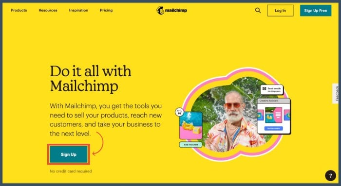
Aside from the bold, irresistible background color, Mailchimp has great calls to action that are hard to miss. Its call to action is a simple sign-up invite.
But what is most outstanding is how the CTAs stand out from the rest of the text.
The dark green CTA button contrasts sharply with the yellow background, making it pop. In addition to the button colors, Mailchimp places its calls in appropriate locations.
One of them is placed above the fold, which is a prime location that stands out to viewers. There is also a fair amount of negative space near the call-to-action buttons. This makes the CTA easier to spot.
Finally, Mailchimp uses three CTAs on this landing page. The best part is that they keep the CTA design all through. Consistency makes the CTAs easy to recognize as the readers scroll down the page.
How To Enhance Your Call To Action Design
- Use the same CTA button color throughout the page.
- Ensure the buttons have the right size, i.e., not too big or too small
- Place your CTAs appropriately
Final Thoughts
Creating an attractive funnel design that works is essential to driving conversions. However, coming up with an effective design does not happen overnight.
You need to understand various design elements and how they work together to create an effective design. The above funnel design ideas will help you get started in your funnel design journey.
You don’t have to implement all the ideas at once. Instead, pick one idea, experiment with it, and test its effectiveness before trying another. Over time, you will create a unique and amazing design.